Fine Art Prints: Why Do Prints Sometimes Look Darker Than the Screen? The Realities of Color Consistency at Astrography
Fine Art Prints appear darker than screens because screens emit light (RGB color mode) while prints reflect light (physical medium). A monitor's backlit display can show much brighter tones than paper can reflect, even with perfect color calibration. Five key factors affect this difference: human perception, display settings, glazing, paper characteristics, and viewing lighting conditions.
A customer recently reached out from our Astrography studio with a common observation: after framing a fine-art print, the image looked "darker" than the digital version, and subtle shadow details—like the structure inside rocket nozzles—were harder to see. This thoughtful feedback opens the door to explain why screens and paper speak different visual languages, what truly influences perceived color and contrast, and how we keep things consistent while prioritizing your satisfaction.
What Causes the Screen vs. Print Color Difference?
The Fundamental Physics: Emitted Light vs. Reflected Light
- Screens emit light. Your monitor, phone, or tablet uses RGB (Red, Green, Blue) pixels that glow, creating additive color by combining light wavelengths. Each pixel can reach high brightness levels—often 200-400 cd/m² or more.
- Prints reflect light. Paper depends entirely on ambient lighting to be visible. The "white" of your paper is just the paper's natural color reflecting light back to your eyes. CMYK inks (Cyan, Magenta, Yellow, Black) absorb certain wavelengths, creating subtractive color.
The result: Even a perfectly calibrated print cannot lift the darkest tones the way a bright, backlit display can. This difference is normal, expected, and rooted in physics—not a printing error.
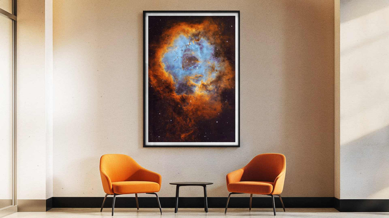
Meet Stunning Space Art Panoramas
5 Factors That Affect Print-to-Screen Color Matching
1. Human Perception: Why We Don't All See Color the Same Way
Our eyes and brains don't perceive color identically. Physiology, visual adaptation, fatigue, and even cultural background influence color perception. Two people viewing the same print under identical conditions may describe it differently.
Key takeaway: Subjective differences in perception are natural—"too dark" or "too light" can be partly personal.


2. Display Settings: The #1 Cause of "Too Dark" Prints
Most monitors ship from the factory set to 50-75% brightness—far too high for print comparison. When your screen is overly bright, images look lighter than they truly are. You compensate by not adding enough brightness to the file, and the print reveals the actual tonal values.
Displays can show dramatically different results depending on:
the chosen color space/profile (e.g., a wide-gamut vs. standard gamut),
overall brightness (often set too high by default),
automatic adjustments (color temperature shifts, “night” modes, dynamic contrast, vivid enhancements),
contrast and gamma controls.
Practical solutions:
- Disable automatic adjustments – Turn off night mode, vivid mode, dynamic contrast, and auto-brightness
- Lower brightness to 100-120 cd/m² – This matches professional print-viewing standards
- Use standard color space – sRGB for web; Adobe RGB for fine art printing
- Calibrate your monitor – Use a colorimeter for accurate color and brightness
Practical tip (agnostic to brand/OS): for fair comparisons, disable automatic image “enhancers,” choose a standard color space, and reduce brightness to roughly match the ambient light in the room where you view the print.

3. Glazing: How Glass and Acrylic Affect Perceived Contrast
Any glazing—especially without anti-reflective (AR) coatings—reduces perceived contrast through reflections and veiling glare. This can turn nuanced shadow details into near-solid blacks.
Paper comparison:
- Without glazing: Full detail visible
- Standard glass: 10-15% contrast reduction
- Museum-grade AR glazing: <5% contrast reduction
Recommendation: if you care about “breathing room” in dark tones, consider museum-grade AR glazing. The difference can be striking.
4. Paper Choice: How Surface Affects Color and Contrast
Paper is an aesthetic choice. Each surface carries contrast and color differently:
Matte – Refined, tactile, slightly gentler micro-contrast; reduces glare
Satin/Lustre – Balanced middle ground between matte and gloss
Gloss – Highest "punch" and contrast, but more prone to reflections
Baryta – Fine-art classic with deep blacks and exquisite shadow gradation; legacy of photographic fiber papers
Important note: A print can be 100% faithful to its ICC profile and still feel different from a glowing display. That's the beauty—and reality—of a reflective, fine-art medium.

5. Lighting: The Stage Your Print Performs On
Prints transform dramatically under different lighting:
Time of day: Natural daylight vs. evening artificial light
Color temperature: Warm (2700K) vs. neutral (5000K) vs. cool (6500K)
Intensity: Dim ambient vs. bright spotlights
Direction: Diffused overhead vs. angled picture lights
Practical tip: for judging tone and shadow detail, use even, adequately bright, neutral lighting. Simply moving the artwork to a better-lit spot often restores “lost” depth. For accurate tone and shadow-detail evaluation, use even, adequately bright, neutral lighting (5000-5500K). A well-placed spotlight can unlock hidden texture
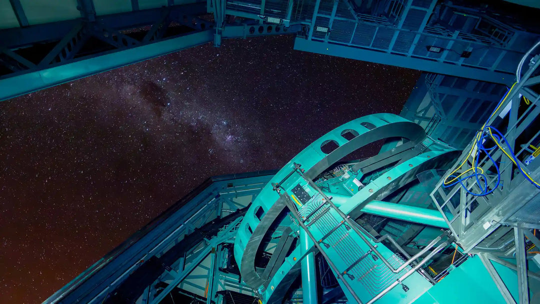
Dive Into the Deep Space Gems
How Astrography manages color—end to end
Color management is one of our core competencies.
Here's how we ensure consistency - we:
Calibrate and profile the entire chain: reference displays, printers, inks, and papers.
Print with paper-specific ICC profiles (e.g., for baryta).
Maintain stable production conditions and quality-check every batch.
Use soft-proofing and, where needed, test prints—especially for very dark, low-key imagery.
Will this make a print identical to a screen? Not 1:1—because the physics differ. But it ensures your print is consistent, repeatable, and predictable within the world of fine-art papers.
A fair way to compare screen and print (quick checklist)
Turn off automatic image “enhancements” (night/eye-comfort/vivid/dynamic modes, etc.).
Use a standard color space/profile appropriate to your workflow.
Lower display brightness to approximate the room where the print hangs.
Evaluate the print without glazing first, then with glazing—so you can see exactly what the glass changes.
View the print in neutral, even lighting (avoid extreme warm spotlights).
Allow 2–3 minutes of visual adaptation before making a judgment.
Remember the paper’s character—matte, satin, gloss, and baryta are deliberate aesthetic choices.

Want more shadow detail? We can help.
Sometimes artists compose in a darker, cinematic key. Sometimes your space or framing absorbs a bit more of the micro-contrast than you’d like.
In such cases, we can prepare a print-oriented tonal variant—a subtle lift in the deepest tones and a tuned black point—so the final print (on your chosen paper, behind glazing, in your lighting) reveals more of what you want to see. This isn’t “breaking the original.” It’s thoughtful tone mapping for a reflective medium.
If you feel some delicate textures are getting lost, tell us. Together we can choose a tonal adjustment, a different paper, AR glazing, or improved lighting.
Mini case: “Details Inside the Rocket Nozzles”
With dark, metallic scenes full of tiny transitions:
Glazing can suppress micro-contrast, turning nuanced darks into near-solid blacks.
Directional lighting (a discrete picture light or well-placed ceiling spot) can open up texture beautifully.
A gentle shadow lift tailored for print often provides the best balance between the artist’s intent and the realities of perception.
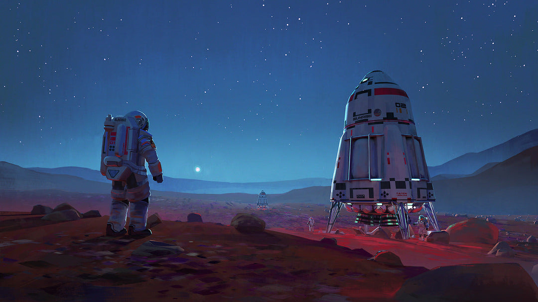
Discover Cosmic Astroscapes From The World
Key Takeaways - In Closing
Differences between screen and paper aren’t errors; they’re intrinsic to the medium.
Perception, display settings, glazing, paper choice, and lighting together shape what you see.
At Astrography, we manage color across the entire chain and happily fine-tune tonal variants to suit your real-world viewing conditions.
If you’d like a little more “air” in the shadows, reach out—we’re here to help.
FAQ Section: You Ask - We Answear
Do I need a professional display?
No. Sensible settings are enough: standard color space, moderate brightness, and no auto “enhancers.”
Is baryta a “darker” paper?
Not by design. It’s known for deep blacks and refined shadow tonality—the very qualities many collectors love.
Can a print ever look exactly like a screen?
Not exactly. But with tonal mapping, paper choice, glazing strategy, and proper lighting, we can get very close in feel.
If I see detail on my screen, does that guarantee the same on paper?
Not automatically. That’s why fine-art printmaking compares overall impression—depth, plasticity, mood—not pixel-by-pixel match.
![Vera C. Rubin Observatory: Revolutionizing Astronomy Through the World's Most Advanced Telescope [All You Need To Know]](http://astrography.com/cdn/shop/articles/vera-c.-rubin-observatory_main.webp?v=1751627507&width=1080)
Leave a comment